# 主题
vk-admin 框架自 1.8.0版本起,支持自定义主题,同时内置了(纯黑、纯白、黑白)3 个主题。
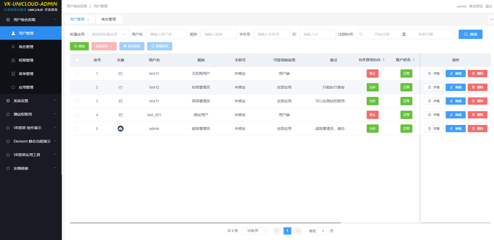
# 黑白主题效果预览
tips:图片被压缩,比较模糊。
# 安装教程
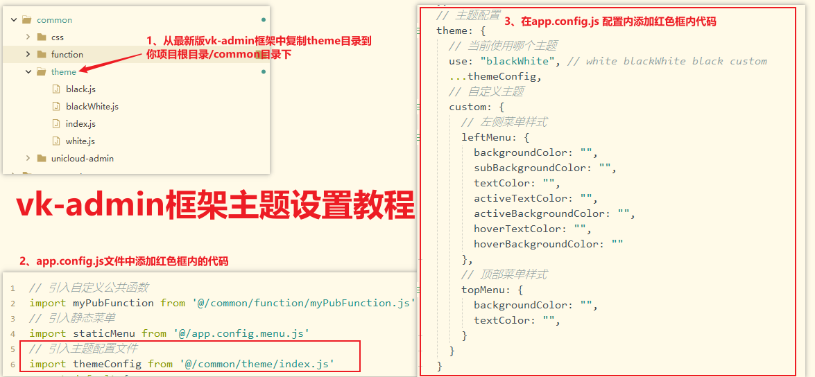
app.config.js 内代码示例
// 引入主题配置文件
import themeConfig from '@/common/theme/index.js';
1
2
2
// 主题配置
theme: {
  // 当前使用哪个主题
  use: "blackWhite", // white blackWhite black custom
  ...themeConfig,
  // 自定义主题
  custom: {
    // 左侧菜单样式
    leftMenu: {
      backgroundColor: "", // 背景色
      subBackgroundColor: "", // 子菜单背景色
      textColor: "", // 菜单文字颜色
      activeTextColor: "", // 菜单被选中时的文字颜色
      activeBackgroundColor: "", // 菜单被选中时的背景颜色
      collapseActiveTextColor:"", // 菜单折叠时选中时的文字颜色
      collapseActiveBackgroundColor: "", // 菜单折叠时选中时的背景颜色
      hoverTextColor: "", // 菜单hover时的文字颜色
      hoverBackgroundColor: "",  // 菜单hover时的背景颜色
      boxShadow: "", // 菜单右边框的阴影
      borderTop: "", // 菜单顶部的边框
    },
    // 顶部菜单样式
    topMenu: {
      backgroundColor: "", // 顶部背景颜色
      textColor: "", // 顶部文字颜色
    }
  }
},
1
2
3
4
5
6
7
8
9
10
11
12
13
14
15
16
17
18
19
20
21
22
23
24
25
26
27
28
2
3
4
5
6
7
8
9
10
11
12
13
14
15
16
17
18
19
20
21
22
23
24
25
26
27
28
使用内置主题时,只需要修改 theme.use 内的值即可,如设置 blackWhite,代表使用黑白主题。
注意:1.8.0 之前的版本,需要先替换项目根目录下的 windows/leftWindow.vue 和 windows/topWindow.vue 两个文件。(从最新版框架项目中复制)
# 如何使用自定义主题?
方式一:将 theme.use 值设置为 custom,然后编写 theme.custom 的样式
方式二:将 theme.use 值设置为 aaa(随你定义),然后在项目根目录/common/theme/目录新建 aaa.js
aaa.js 代码模板
// 黑白主题(左侧菜单黑,顶部白)
export default {
  // 左侧菜单样式
  leftMenu: {
    backgroundColor: '#191a23',
    subBackgroundColor: '#101117',
    textColor: 'rgba(255,255,255,0.8)',
    activeTextColor: '#ffffff',
    activeBackgroundColor: '#2d8cf0',
    collapseActiveTextColor: '#2d8cf0',
    collapseActiveBackgroundColor: '#2c3239',
    hoverTextColor: '#ffffff',
    hoverBackgroundColor: '#545f6c',
    boxShadow: '2px 0 4px rgba(0,21,4,0.25)',
  },
  // 顶部菜单样式
  topMenu: {
    backgroundColor: '#ffffff', // 顶部背景颜色
    textColor: '#999999', // 顶部文字颜色
  },
};
1
2
3
4
5
6
7
8
9
10
11
12
13
14
15
16
17
18
19
20
21
2
3
4
5
6
7
8
9
10
11
12
13
14
15
16
17
18
19
20
21
# 如何分享自己的主题?
1、直接将 aaa.js 文件发给你的好友。(可以上传到群里,Q 群:22466457)
2、好友将 aaa.js 文件复制到 项目根目录/common/theme/ 内,同时修改 /common/theme/index.js 文件,引入 aaa 主题
import white from './white.js';
import black from './black.js';
import blackWhite from './blackWhite.js';

import aaa from './aaa.js';

export default {
  white,
  black,
  blackWhite,

  aaa,
};
1
2
3
4
5
6
7
8
9
10
11
12
13
2
3
4
5
6
7
8
9
10
11
12
13
3、最后修改 theme.use 内的值为 aaa,代表使用 aaa 主题。
# 页面组件尺寸配置
框架支持通过 pageStyle.size 统一管理页面中按钮、表单等组件的尺寸,并提供响应式自动适配。
# 配置
在 app.config.js 中配置:
pageStyle: {
  // 表单组件和表格组件的 size
  size: 'auto', // medium / small / mini / auto
},
1
2
3
4
2
3
4
| 值 | 说明 |
|---|---|
medium | 中等尺寸 |
small | 小尺寸(Element UI 默认值) |
mini | 迷你尺寸 |
auto | 自动模式(默认值):屏幕宽度 > 1600px 时使用 medium,否则使用 small |
# 使用
配置为 auto 时,框架会根据屏幕宽度自动计算尺寸,通过全局变量 this.$global.size 获取实际生效的值:
<el-button type="primary" :size="$global.size">添加</el-button> <el-input :size="$global.size" placeholder="请输入"></el-input>
1
TIP
建议使用 auto 模式,这样在大屏和小屏设备上都能获得合适的组件尺寸,无需手动调整。